
Data visualization tools are essential for businesses and organizations to make sense of complex data sets and communicate insights effectively. These tools help in transforming raw data into visual representations such as charts, graphs, and maps that are easy to understand and interpret. In today’s digital age, where data is generated at an unprecedented rate, the ability to visualize and analyze data efficiently is crucial for making informed decisions and uncovering hidden patterns and trends. In this article, we will explore the importance of data visualization tools, their benefits, and some popular tools used in the industry.
One of the key benefits of using data visualization tools is the ability to identify trends and patterns in data quickly. By representing data visually, patterns that may not be apparent in raw data can be easily spotted, leading to valuable insights and informed decision-making. For instance, a line graph showing sales trends over time can help businesses identify seasonal patterns and make adjustments to their marketing strategies accordingly.
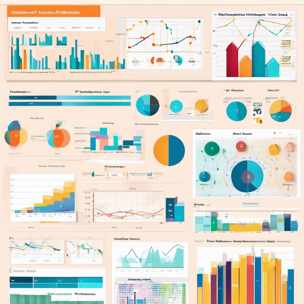
Moreover, data visualization tools enable users to communicate complex information in a clear and concise manner. Visual representations such as pie charts, bar graphs, and heat maps can simplify complex data sets and make them more accessible to a wider audience. This is especially important in a business setting where stakeholders may not have a technical background but need to understand and act on data-driven insights.
In addition to improving data analysis and communication, data visualization tools also enhance collaboration among team members. By sharing interactive visualizations, team members can work together to explore data, ask questions, and gain new perspectives. This collaborative approach fosters creativity and innovation, leading to more effective problem-solving and decision-making processes within organizations.
There is a wide range of data visualization tools available in the market, each offering unique features and capabilities to suit different needs. Some popular tools include Tableau, Microsoft Power BI, Google Data Studio, and D3.js. These tools allow users to create interactive dashboards, customize visualizations, and connect to various data sources for real-time updates.
Tableau is a powerful data visualization tool that enables users to create interactive dashboards and visualizations with ease. It offers a user-friendly interface and a wide range of visualization options, making it popular among data analysts and business users alike. With Tableau, users can explore data, create insightful visualizations, and share their findings with others effortlessly.
Microsoft Power BI is another popular data visualization tool that integrates seamlessly with Microsoft products such as Excel and SQL Server. It allows users to create interactive reports and dashboards, collaborate with team members, and access data from multiple sources. Power BI’s intuitive interface and robust features make it a preferred choice for organizations looking to harness the power of data visualization.
Google Data Studio is a free data visualization tool that enables users to create interactive reports and dashboards using data from various sources such as Google Analytics, Google Sheets, and BigQuery. With its drag-and-drop interface and customization options, users can design visually appealing reports that provide valuable insights at a glance. Google Data Studio is ideal for small businesses and individuals looking to create professional-looking visualizations without the need for advanced technical skills.
D3.js, short for Data-Driven Documents, is a JavaScript library that allows users to create dynamic and interactive data visualizations on the web. With D3.js, users can manipulate data and design custom visualizations using HTML, CSS, and SVG. This powerful tool is favored by developers and data scientists for its flexibility and ability to create highly customized visualizations tailored to specific requirements.
In conclusion, data visualization tools play a crucial role in helping businesses and organizations make sense of data, communicate insights effectively, and drive informed decision-making. By leveraging the power of visual representations, users can uncover hidden patterns, identify trends, and collaborate with team members to achieve common goals. Whether you are a data analyst, a business user, or a developer, exploring the diverse range of data visualization tools available can empower you to unlock the full potential of your data and turn it into actionable insights.